When looking for dentistry, there are a lot of factors that people consider before choosing one. Because when it’s finally picked out, people want to stick to it for good.
Scale up the potential of your dentistry to be their go-to with this succinct yet informative mailer.


Large size:
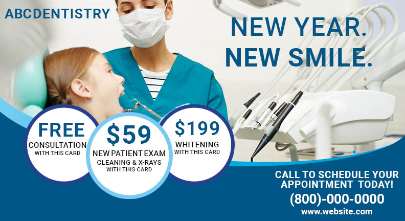
This is a larger size variant with spacious areas to place your information in an attractive way. Display your high-end equipment with actual photographs of your well-equipped clinic. Show them that they will be cared for with pictures capturing services in action. A larger mailer size can encompass all these nuances.
Distinct logo:
This is a larger size variant with spacious areas to place your information in an attractive way. Display your high-end equipment with actual photographs of your well-equipped clinic. Show them that they will be cared for with pictures capturing services in action. A larger mailer size can encompass all these nuances.
Telltale, high-quality image:
Show your services with a clean ambiance for that professional touch, without the use of words.
4-word short headline:
People love short headlines that assure them that they’re in good hands. Short headlines are easy to remember. Use words like ‘smiling teeth,’ ‘happy faces,’ to indicate better dental health.
3 attractive offers:
People don’t particularly like going to a dentist. Your offers give them the push they need to make up their mind. Offers are important to keep that footfall coming in. Show 3 different offers with varied services and engage a wider audience.
Clear-cut contact information:
People are looking for a dentist they can visit for regular checkups. Show your easy accessibility with well-defined contact mediums where they can book appointments easily.
Repetitive Logo:
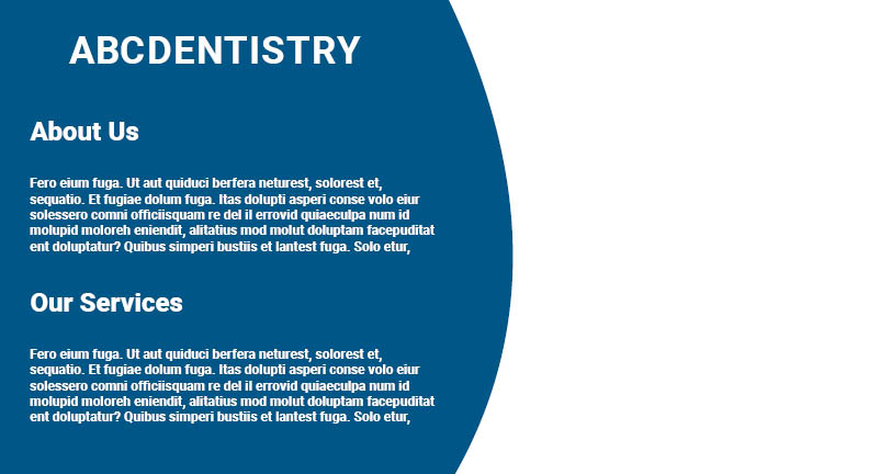
Remind them that they’re reading specifically about you as they get to the back page. Repeating your name makes them more familiar with you on a personal level as they read the rest of the communication.
Appealing image partition:
The human eye loves symmetry and asymmetrical symmetry. Dividing your template into asymmetric portions makes your mailer more memorable. People will at least retain your visual in the back of their minds when thinking about dentists.
Elaborate description:
Once interested, people will be keen to know more about you and your services. While the first page speaks with visuals, the second page can match up with an elaborate story about your brand and services.
Like this design? Make it yours! Customize it here!


