
Reach the right people, at the right time without wasting precious church funds!
CTA-like headline:
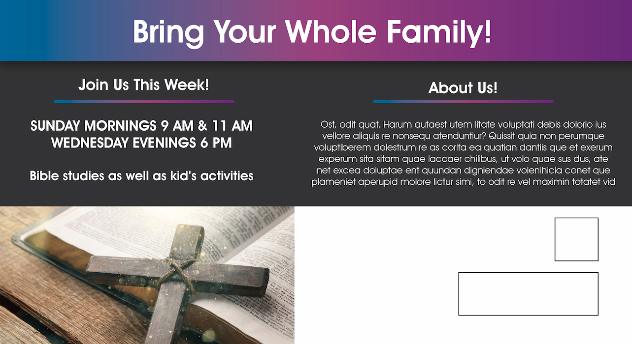
A 4-word invitation to visit keeps your reader interested and feel welcome. People are more likely to visit you when you invite them with open arms.
Inviting subheadline:
A positive affirmation to the headline, this subheadline maintains continuity by welcoming the reader.
Clear timings:
Show your gathering times right below the subheadline to appeal to varied audiences. Most families visit churches on weekends. But combined with a mid-week option, it gives people an opportunity to be more involved.
Broad religious background image:
Using a prominent image will communicate your church’s tranquility. Use holy quotes like ‘Spirituality lies in the heart’ so your audience relates to sacred values.
Distinct contact information:
People look for churches within their locality since most of them visit weekly. The website gives them an idea of what to expect before they show up. Mentioning your contact number will help you resolve any questions they may have.
Personified logo:
Project your church’s personality with your logo. Calming colors and simplicity play a huge role in this aspect.
Direct headline:
Church-goers almost always visit with family. Engage the whole household with a direct invitation.
Repetitive accessibility:
Repetition helps people remember things. Repeat your timings on the back of your mailer to increase the chances of them visiting your church.
Elaborate description:
Associating with a church means associating with its history too. Help people connect with you through a descriptive narrative of your origins and history in the ‘About Us’ section.
Religious images:
Continue the theme of tranquility with two more images at the back of the mailer. Add a custom image on the right side with concise text to help describe it.
Like this design? Make it yours! Customize it here!


