Showcase your floral variety and floristry with this template.
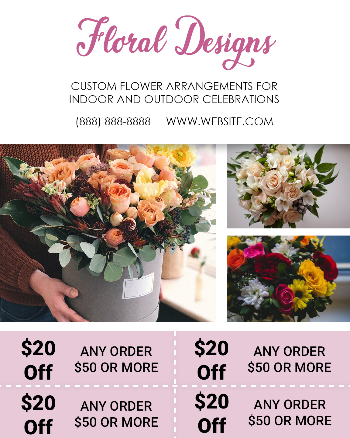
Striking logo:
A unique logo makes a great first impression.
Two-sentence headline:
A concise headline with spatial symmetry appeals to the eye. Use this space to talk about your service USPs.
Distinct contact information:
Displaying your contact information right at the beginning of your mailer ensures a higher response rate. People can call you for direct orders, or browse through your website to view the different flower arrangements offered.
Large images:
Vividly colored images attract attention and give your customers a visual idea of your store.
Four attractive offer coupons:
Four enticing deals in a single flyer? That’s something hardly anyone wants to miss out on. Your prospective customers are likely to keep this mailer to use the coupons later.
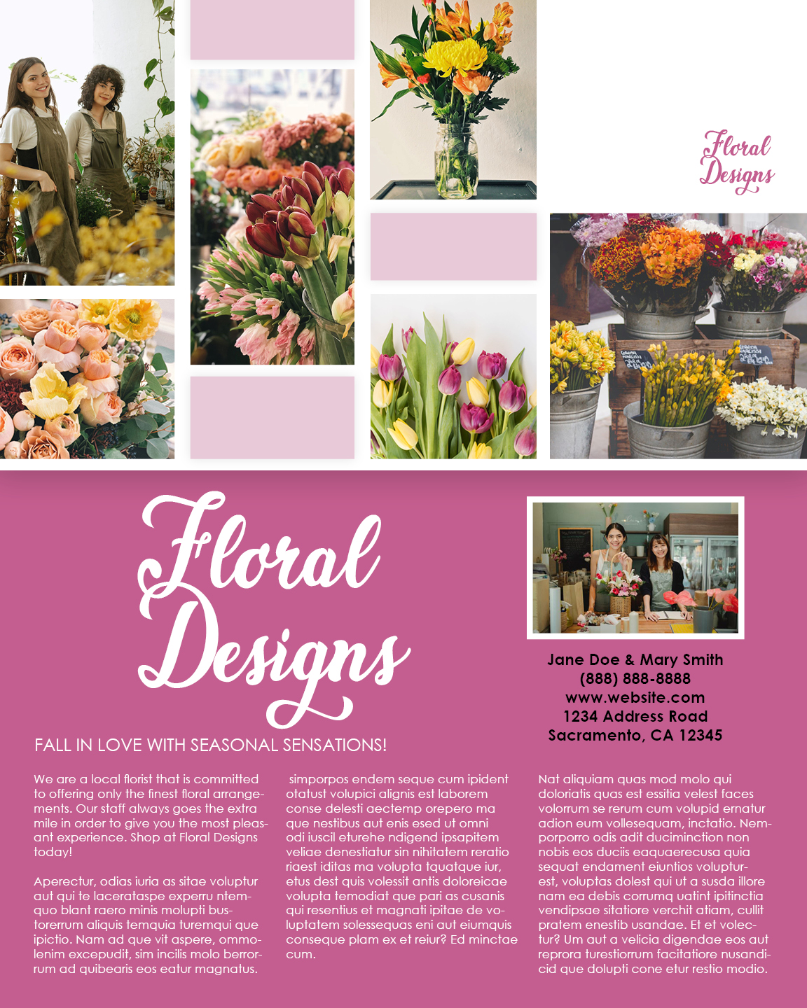
Vibrant floral collage:
Showcase your best flower arrangements with a six-image collage.
Repeating your logo:
Repetition of the logo increases brand recall.
Founder image:
Humanize your business with a founder’s image. People connect better to a brand with human elements.
Precise contact information:
Add in your store address to invite people for walk-in purchases. People can reach you for inquiries through the website and landline options respectively.
Detailed description:
People want to know about your services in depth before they make a purchase. Highlighting key segments of your offered services along with a detailed explanation of each helps people know exactly why they should choose you.
Liked this design? Customize it and Make it your own!


